
Forms6 min read
Accessible forms: labels, errors, keyboard
What makes an online form usable for everyone: labels, groups, clear error messages, keyboard, focus and target sizes — according to WCAG 2.2.
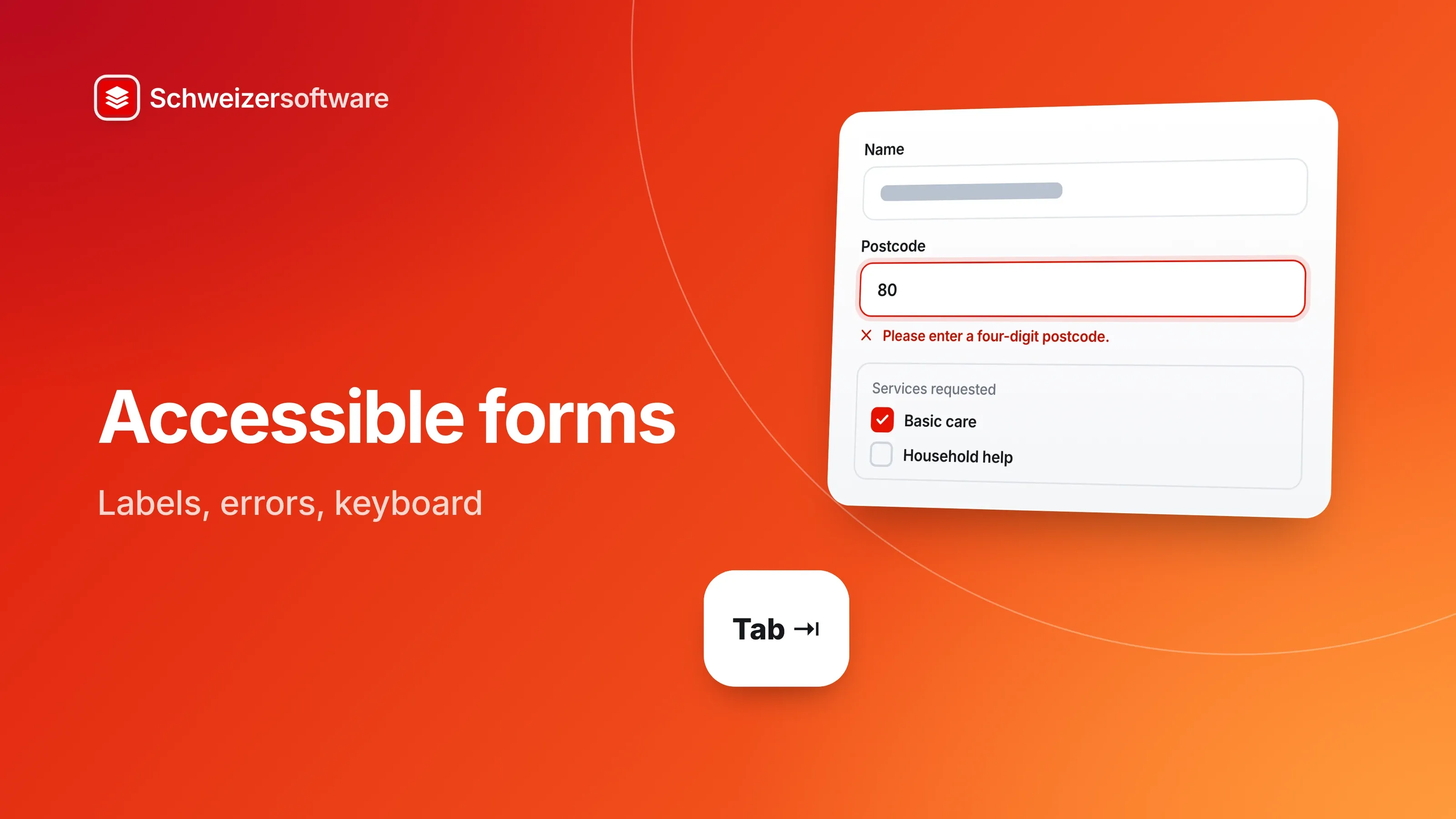
A Spitex organisation in the Emmental takes requests through an online form: name, address, services requested, a field for comments. One day, a client’s daughter calls. Her mother has poor eyesight and tried to fill in the form with the screen magnifier. After sending it, the page turned red, but she could not work out what was wrong — the message was at the top, far outside the magnified section.
For a Spitex whose clients are often older, this is not an edge case. Many of these obstacles can be avoided with a few principles that the W3C describes.
Who uses forms differently
Not everyone fills in a form with a mouse and their eyes. Some people listen to the screen with a screen reader, others do everything with the keyboard, magnify the display a lot or need more time to understand instructions. Then there are situations that can affect anyone: a broken arm, a phone in glaring sunlight, a language you do not know well.
The W3C’s Web Content Accessibility Guidelines (WCAG) are the international benchmark for this. Version 2.2 was published on 5 October 2023. The W3C has also published a dedicated tutorial on forms, last updated in March 2026.
Labels
The W3C tutorial starts with the principle of identifying every form field with a label,
usually with the HTML element label. The label is connected to the field — a screen reader
reads it out as soon as the field is reached, and a click on the label puts the cursor in the
field. WCAG requires labels or instructions when input is expected (success criterion 3.3.2).
A grey hint inside the field that disappears when typing starts is no substitute for a label: as soon as someone begins to write, it is no longer visible what the field was for.
Letting the browser fill in
Browsers can insert a name, address or email address from saved details if the form says what a field is for. WCAG requires that the purpose of fields collecting information about the user can be determined programmatically (success criterion 1.3.5). For people who find typing hard, this saves a lot of work — and typing errors in the address along with it.
Groups
Some fields belong together, such as the choice of services — Basic care, Household help, Meal
service — or the question “Who is filling in this form?”. The W3C tutorial recommends grouping
them with the elements fieldset and legend. A person using a screen reader then hears not
just “Household help, checkbox” but also which question it belongs to.
Instructions in the right place
The W3C tutorial recommends giving instructions that help with filling in the form — for the form as a whole and for individual fields. What matters is where they appear: a note on the format of a date belongs before the field, not only in the error message. And required fields are marked in a way that is recognisable without colour, for example with the word “required”.
Error messages that help
The caller’s mother got stuck at a typical point. WCAG requires that a detected input error is identified and described in text (success criterion 3.3.1), and that, where possible, a suggestion for correcting it is given (success criterion 3.3.3). In addition, information must not be conveyed by colour alone (success criterion 1.4.1).
For the Spitex, in practice, that means:
- The message sits next to the field concerned, not just at the top of the page.
- It says what is missing or wrong — “Please enter a four-digit postcode” instead of “Invalid entry”.
- Fields already filled in stay filled in.
- A red outline alone is not enough; a text, or a symbol with text, belongs with it.
Keyboard and focus
A form must be fully operable with the keyboard (success criterion 2.1.1): from field to field with the Tab key, choices with the arrow keys, sending with the Enter key. Where the focus is at any moment must be visible (success criterion 2.4.7).
WCAG 2.2 adds a new criterion: when an element receives keyboard focus, it should be at least partially visible and not hidden by other content (success criterion 2.4.11) — such as a cookie notice bar or a fixed header.
Enough room to tap
The size of controls counts too. With the new success criterion 2.5.8, WCAG 2.2 requires targets to have a minimum size — 24 × 24 CSS pixels — or enough spacing from other targets. Small checkboxes packed closely together are hard to hit for people with shaky hands or on a small screen.
Not asking twice
Another new criterion in WCAG 2.2 concerns forms directly: information someone has already entered in the same process should not be requested again (success criterion 3.3.7). Anyone who has already given the client’s address should not have to type it again for the billing address — a “same as above” is enough.
And when logging in, nobody should have to solve a puzzle, remember something or copy something out (success criterion 3.3.8). How forms can be protected against spam without such obstacles is covered in the post Spam in contact forms.
Long forms
For long forms, the W3C tutorial recommends splitting them into several smaller steps and indicating progress — “Step 2 of 4”. This helps everyone, but especially people who need more time or have to stop in between.
What applies in Switzerland
The Disability Discrimination Act requires authorities to make their services on the internet accessible to people with visual impairments without making things harder for them (Art. 14 para. 2 BehiG), and prohibits private parties offering services to the public from discriminating against people with disabilities because of their disability (Art. 6 BehiG). In version 3.0, the e-government standard eCH-0059 is based on WCAG 2.1 and applies primarily to public bodies and licensed companies. Which obligations apply to a particular organisation depends on its role.
For the Spitex in the Emmental
The Spitex has its form reworked: every field has a visible label, the services are grouped together, error messages sit next to the field and say what to do. The form can be filled in with the keyboard, the focus is clearly visible, and the billing address can be taken over with a tick. The client’s daughter has tried it again with her mother.
In the Forms app we are building, answers will be encrypted in the browser of the person answering and only become readable again for the recipient. Which accessibility criteria the app’s forms meet, we will describe on its page as soon as it launches.
Sources
- 1.W3C: Web Content Accessibility Guidelines (WCAG) 2.2 (checked on 25 September 2026)
- 2.W3C WAI: What’s New in WCAG 2.2 (checked on 25 September 2026)
- 3.W3C WAI: Forms Tutorial (aktualisiert 27. März 2026) (checked on 25 September 2026)
- 4.Behindertengleichstellungsgesetz (BehiG, SR 151.3) (checked on 25 September 2026)
- 5.eCH-0059 Accessibility Standard V3.0 (checked on 25 September 2026)
 Schweizerform
This idea became Schweizerform.
Online forms with end-to-end encryption, made and hosted in Switzerland.