
Image tools6 min read
Optimising images for your website: size, format, loading time
How images shape a website’s loading time and what helps: the right size, several versions, modern formats, width and height, lazy loading, alt text.
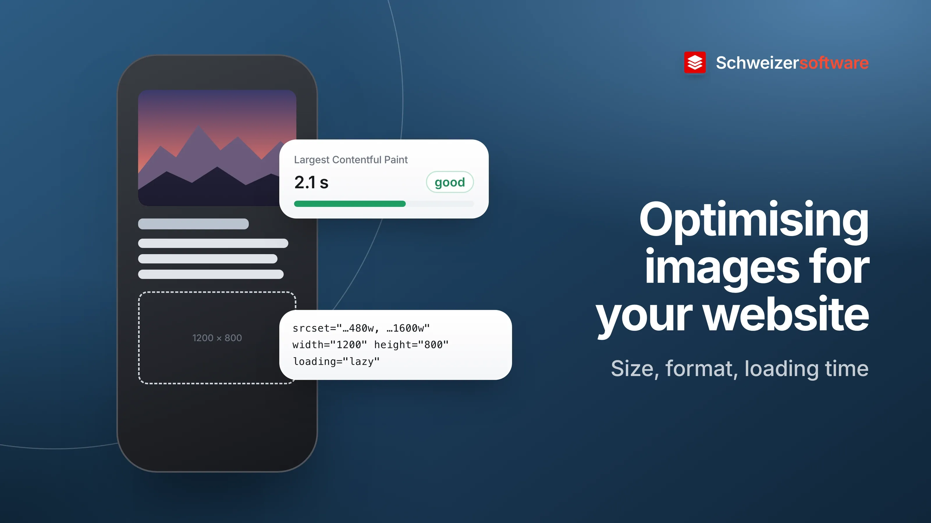
A winery on Lake Biel has a new website. At the top, a large image of the vineyards in autumn light; below it the wines, each with a photo of the bottle, and a gallery from the estate festival. On the office computer, everything looks lovely. On a phone, on the train, the page builds up piece by piece, and the text jumps down as soon as an image has finished loading.
Both have to do with the images. And both can be improved considerably in a few steps, without the images looking any worse.
Why images shape loading time
A widely used measure of how fast a page feels is the Largest Contentful Paint (LCP). web.dev, an information site by Google for web development, describes it as follows: it measures when the largest image, text block or video in the visible area has been rendered, counted from when the page was requested. A value of 2.5 seconds or less is considered good.
On a page like the winery’s, the largest element is an image — the image of the vineyards. How quickly this one image loads therefore shapes the first impression.
The right size
The biggest lever is size. A photo from a current camera is several thousand pixels wide; on a phone it may appear 400 pixels wide. MDN notes that there is no point embedding such large images for a small screen: it wastes bandwidth, and people on a mobile connection do not want to download a large image meant for a computer when a small one will do.
The arithmetic is quadratic. web.dev points out that a screen with double the pixel density needs four times as many pixels. Conversely, an image at half the width has only a quarter of the pixels.
Several versions with srcset and sizes
Because phones, tablets and computers need different sizes, a website can offer the same image
in several versions. MDN describes the attributes srcset and sizes for this:
srcsetlists the available versions with their width in pixels, for example one 480 and one 800 pixels wide.sizestells the browser how wide the image is displayed at which screen size.
The browser then chooses the right version itself. For screens with a high pixel density, versions at double resolution can also be specified. Some website builders and website programs create such versions automatically — whether that happens is worth checking.
The format
For raster images on the web, MDN recommends WebP or AVIF first, with a fallback in JPEG or PNG for browsers that do not know these formats. As a guide, MDN states that lossy WebP images are on average 25 to 35 percent smaller than JPEG images of similar quality. Which format suits which image is described in the post Which image format for what.
Specifying width and height
The jumping text has a cause of its own: as long as an image has not loaded, the browser does not know how much space it needs. When it arrives, it pushes the rest of the page down.
MDN describes the solution: if the width and height of the image are specified in the HTML, the browser can calculate the aspect ratio before the image has loaded and reserve the space needed. This reduces or prevents the shift — according to MDN, an important part of a good user experience.
Lazy loading
The gallery from the estate festival is far down the page. Anyone who only wants to look at the
wines does not need these images. With the attribute loading="lazy", the browser defers loading
an image until it approaches the visible area. MDN describes how this means network and storage
are not used for images before it is reasonably certain they will be needed.
For the large image right at the top, on the other hand, deferring brings little: it is visible as soon as the page opens and should appear as quickly as possible. MDN also points out that width and height are particularly important for lazily loaded images.
Alt text
Optimising also means making images accessible to everyone. According to MDN, the alt
attribute contains text that can replace the image — screen readers read it out, and it appears
when an image cannot be loaded. An empty alt text marks an image that is purely decorative. For
the winery’s bottle photos, a short sentence such as “Bottle of Chasselas 2025 from Lake Biel” is
enough.
Background images count too
Not every image appears as an img in the HTML. Some websites use large images as a background
via CSS, for example behind a heading. web.dev also lists such background images among the
elements that count for the Largest Contentful Paint. The same rules apply to them: the right
size, the right format. Only width and height cannot be specified through attributes there — the
space is set by the design.
Measuring instead of guessing
Whether the changes work is shown by measuring. web.dev recommends looking at the Largest Contentful Paint at the 75th percentile of page loads, separately for mobile devices and computers — in other words, so that three out of four page loads reach the value. The browsers’ developer tools also show, for every page, which images are loaded, how large they are and how long it takes. A look before and after optimising makes the effect visible.
Metadata and location
Photos from cameras and phones often contain metadata, sometimes including the exact location where they were taken. On a website this is superfluous and makes the file larger. For photos taken in one’s own home, it also gives away the address. It can be removed at the same time as resizing.
For the winery on Lake Biel
The winery goes through its images once: the image of the vineyards is created in three widths
and offered via srcset, as WebP with a JPEG fallback. All images get a width, a height and an
alt text, the gallery is loaded lazily, and the metadata is removed. On a phone on the train, the
text now stays put while the images load.
The image tools we are building will resize and compress images, convert them between JPG, PNG, WebP and HEIC, and strip their metadata — processed in Switzerland, in memory, without any image being kept, and in confidential mode entirely on your own device.
Sources
- 1.web.dev: Largest Contentful Paint (LCP) (aktualisiert 4. September 2025) (checked on 25 September 2026)
- 2.MDN Web Docs: Using responsive images in HTML (checked on 25 September 2026)
- 3.MDN Web Docs: The Image Embed element (img) (checked on 25 September 2026)
- 4.MDN Web Docs: Image file type and format guide (checked on 25 September 2026)
- 5.web.dev: Choose the right image format (aktualisiert 13. August 2024) (checked on 25 September 2026)
Be told when it launches
This idea is still being planned. Sign up and we will write to you once, when it becomes an app. Signing up is non-binding – no newsletter, no advertising.
View the idea